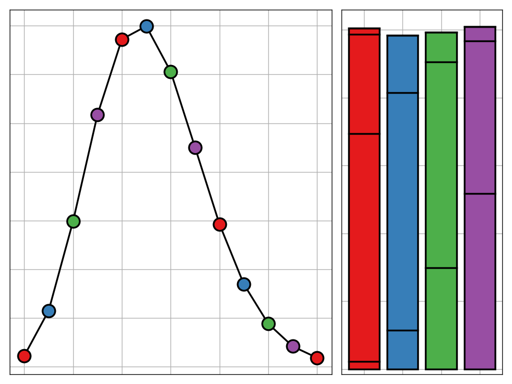
Bank Holiday Bodge: The Sentiment of Shakespeare
As much as we'd like to in order to appear cultured, it is likely that many of us just haven't found the time or motivation to get through the iconic Shakespeare plays we are all familiar with. I don't have a full solution for that, but at the very least, this post presents a way of understanding the general narrative arc of the plays from a quick glance.
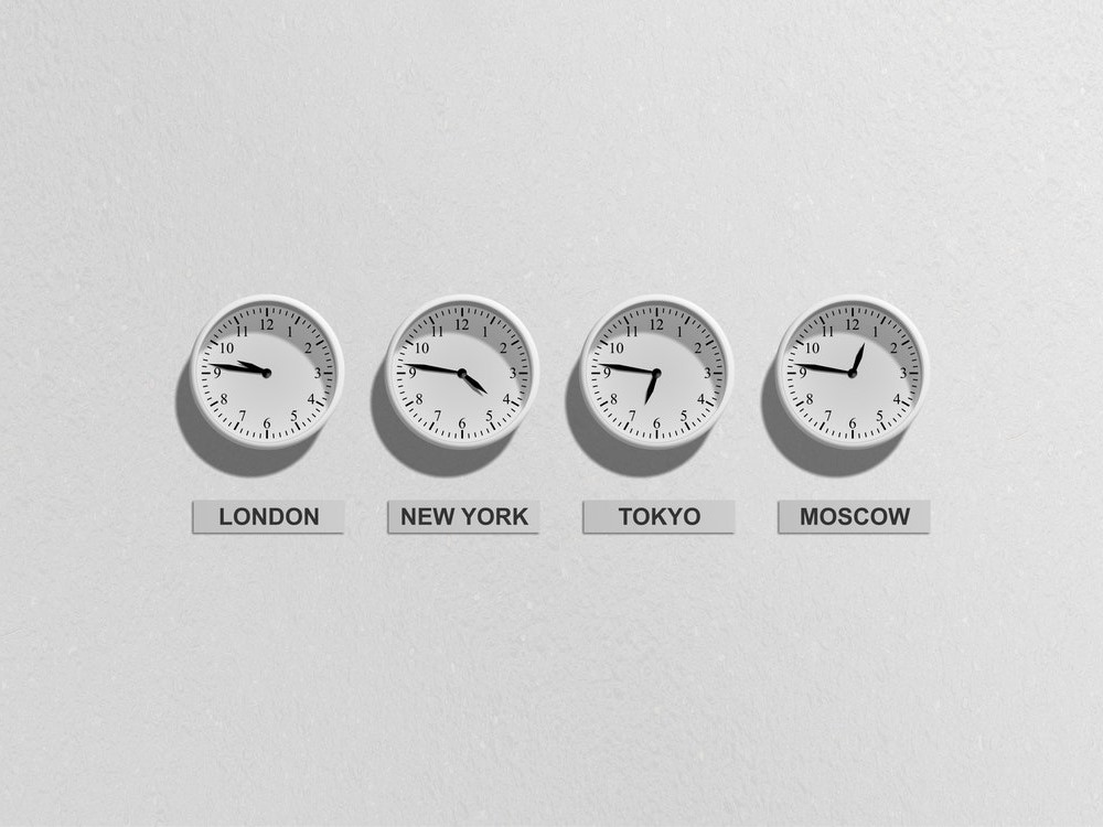
An Analysis of Strange Timezones
Timezones are strange things. Be it Chatham Island's 45-minute offset or West Bank's ethnically divided use of daylight saving, it almost seems like the timezones of the world were chosen to baffle. In this post we ask which capital city has a timezone that differs the most from what would be expected given its longtitude. Any guesses?

Bank Holiday Bodge: Parametric Snowflakes
After yesterday's post drawing Christmas trees with Python, it's time to give R a chance to shine. In this post, I use the shiny and ggvis packages to build a webapp for generating parametric snowflakes.
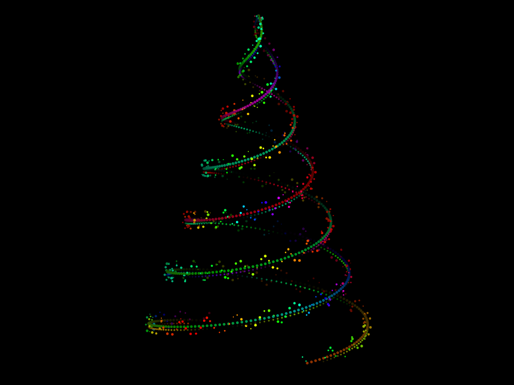
Bank Holiday Bodge: Coding up Christmas
Christmas is here but that's no excuse to stop coding. In the second installment of the bank holiday bodge series, there will be a major change in format but the principle will stay the same—showcasing a rough piece of work brought to fruition in a single day. This post will concern the use of parametric equations and the animation module from matplotlib to generate your own ornamented Christmas tree animation
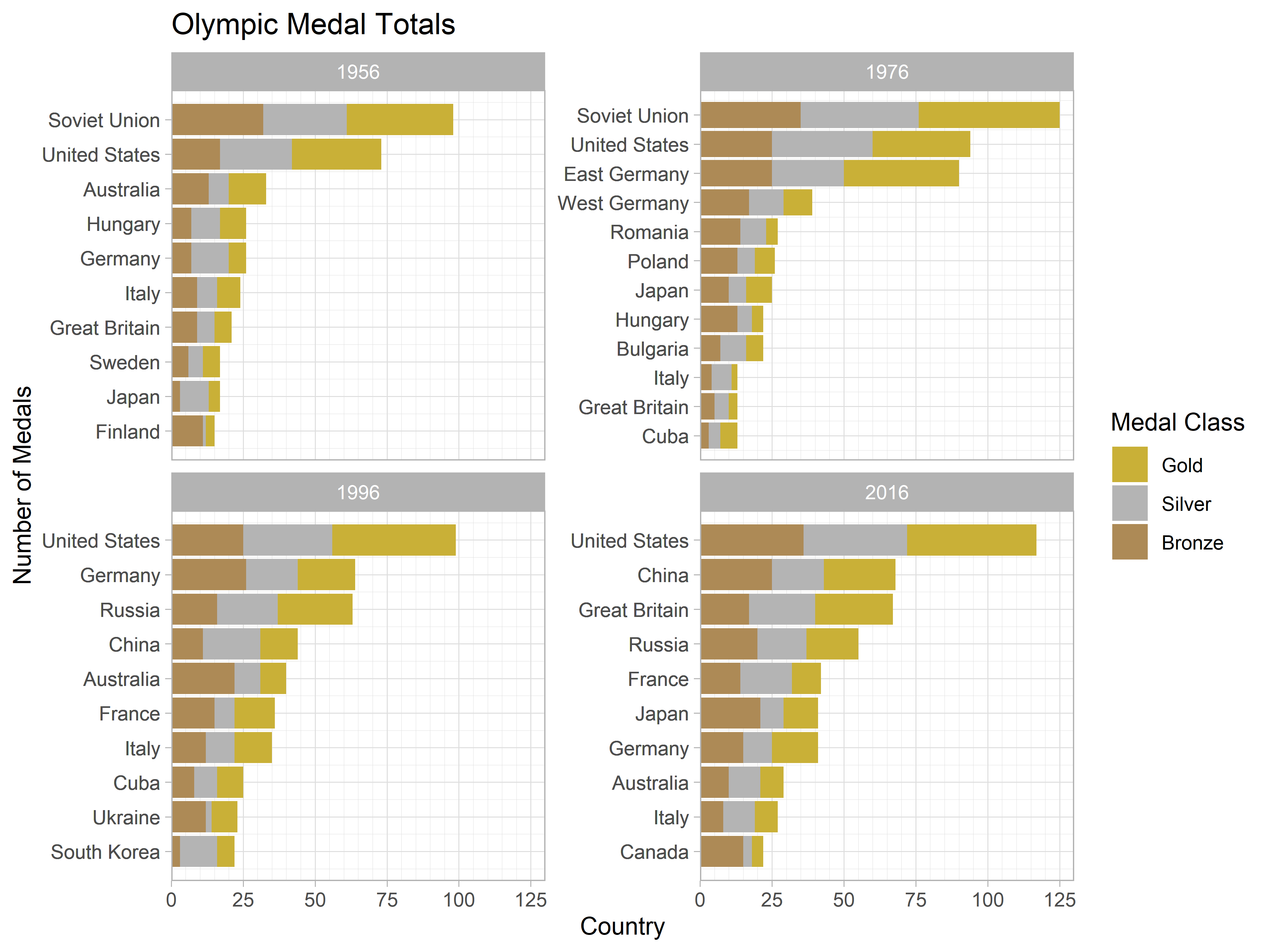
Ordering Factors within a Faceted Plot
ggplot2 is an amazing tool for building beautiful visualisations using a simple and coherent grammar—that is, when it wants to play nice. Sadly, this is not always the case and one can find themselves developing strange workarounds to overcome the limitations of the package. This post discusses one of these approaches, used to facilitate the correct ordering of factors within a faceted plot.
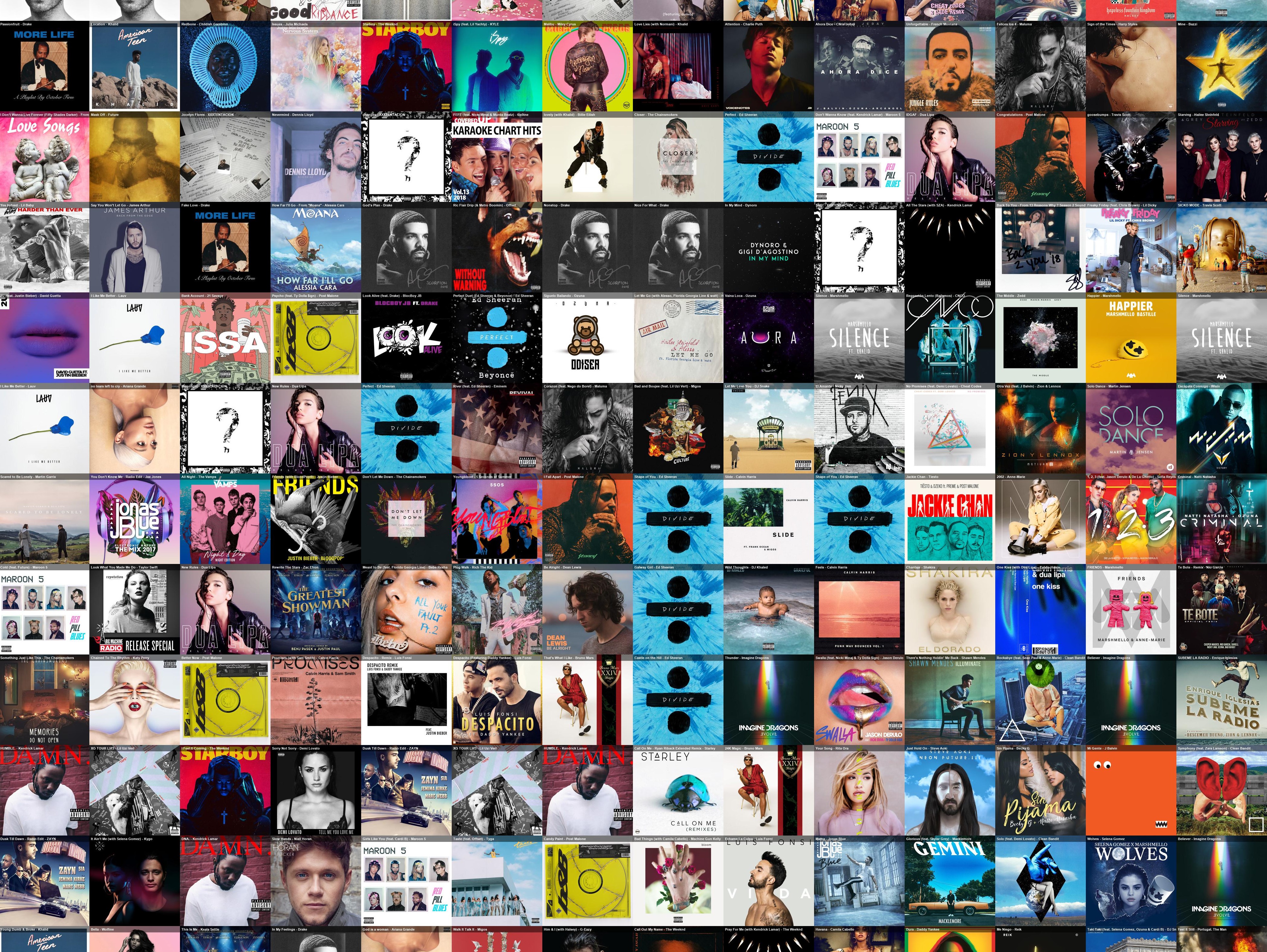
Bank Holiday Bodge: A Wall of Music
Sometimes, perfection overkill. In this spirit I would like to introduce a series of new blog posts - each installment of which being written and released on a UK bank holiday - in which I plan, build, and discuss a data science project all within the span of one day. In this maiden post, I use technqiues in dimensionality reduction and web-scrapping to produce a 'Wall of Music' based off the 2017/18 Spotify top 100 tracks.
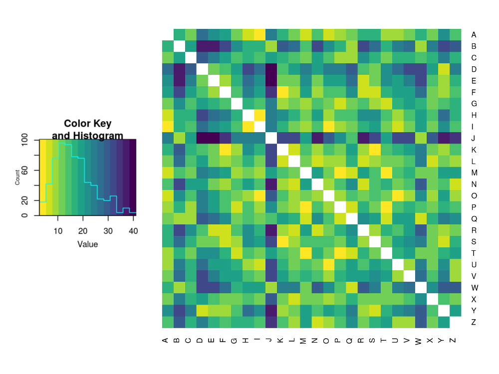
Letter Distributions in the English Language and Their Relations
If you've ever tried to solve a simple cryptography problem, then you may have developed an intuitive sense of where you're most likely to find a letter in a word. For example, 'Q's are rarely at the ends of words whereas 'D's are much more likely to be found there. This post explores this idea and concludes by clustering the letters of the Latin alphabet based on their distributions throughout English words.
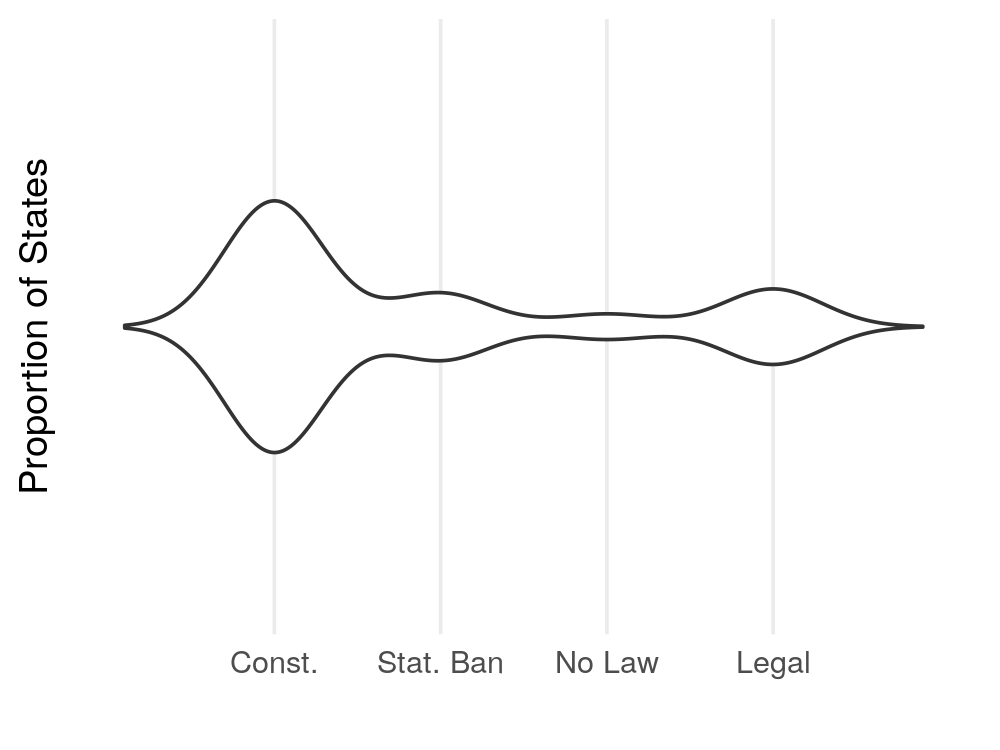
Gloopy Violin Plots
The fourth dimension is often overlooked in data visualisation applications but, in doing so, are we potentially missing out on some more effective ways to present data? In this post, I argue that there are certain use cases where adding a temporal dimension to your visualation greatly improves the clarity of the result in expressing you message. Furthermore, I offer an example of such a visualisation, produced using the `gganimate` package.
Recent