For the previous bank holiday bodge, I took a look at using the Spotify top songs datasets from Kaggle and, with the help of UMAP and RasterFairy, built a wall of cover art in which similar songs were positioned close to one another. The format of the post involved me walking through my every step, mistakes and all. The result of this was a ridiculous 5000+ word read.
I do think there is a utility to such posts that go into complete detail, but I think the idea works better as a standalone concept rather than combining it with ‘the bodge’. Therefore, this post will be short and sweet; first showing off the finished product and then taking a few paragraphs to talk about some of the challenging elements of the project.
It’s Beginning to Look a Lot Like Christmas
In my extended family, Christmas Day is one of those occasions that takes some time to get going. That’s understandable; people have worked hard for the entire year and so a lie-in and lazy morning is well-deserved. Habits die hard though, and after several months of waking up at 6am to beat traffic (a post analysing my commute will be out in early March) Christmas Day wasn’t going to be any different.
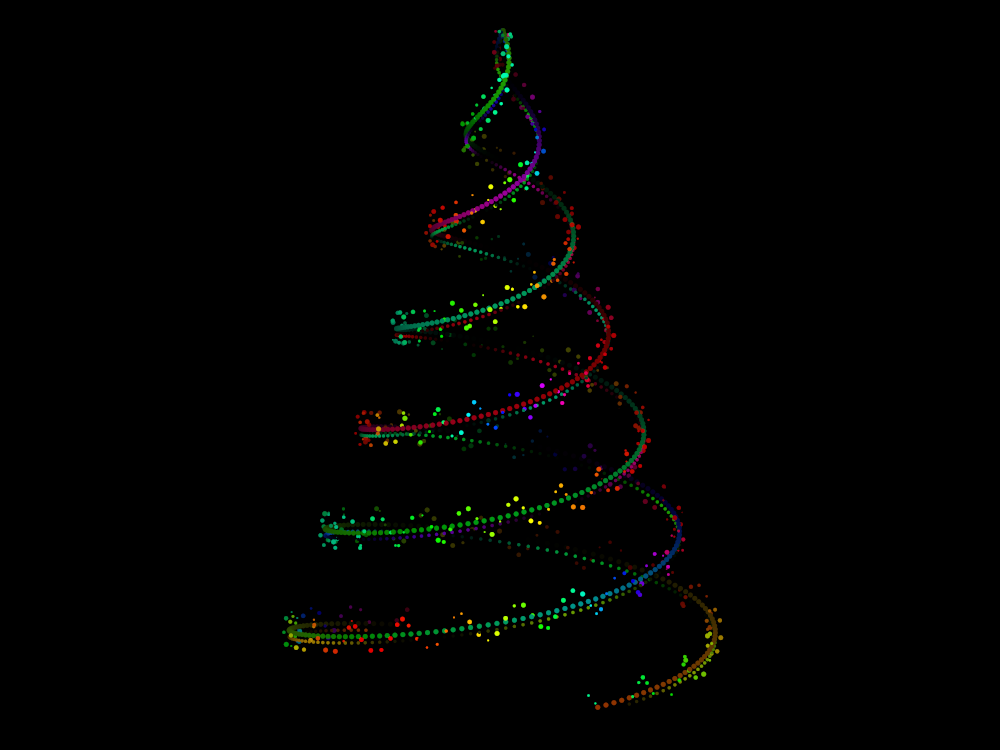
This gave me a window of a few hours before the festivities began to bash out a Christmas-themed bodge. The result of this whirlwind coding session was the following animation.
The resolution of this version of the animation is kept low to improve page loading times. By using the source code linked a few paragraphs down, you are free to produce a high-quality version at the expense of file size.
This animation is based on a classic reddit thread titled t * sin (t) ≈ Christmas tree. In this, many users discuss the use of parametric equations to generate Christmas trees. The coding in this thread is almost entirely in Mathematica and JavaScript. I therefore decided to port this idea to Python using the matplotlib.animation module and jazz up the tree with some ornaments in the process.
The source code for this animation can be found here. There are many tweakable parameters to change the look of the tree so definitely have a play around if you have time.
For those interested in the use of matplotlib.animation for creating such 3D parametric animations the you may want to read further. The documentation for the module is rather poor, resulting in me performing a lot of experimentation. Therefore in the next section I will discuss some of the hacks and tricks I used to get such a plot working so that I can save others time when they tackle similar projects.
For any one else, Merry Christmas and a Happy New Year!
The (Nervous) Breakdown
Although I still managed to complete this project in one morning, it was a lot more fuss than I thought it would be when I first got going. The matplotlib.animation module has notable short-comings which I needed to work around to produce this visualisation, the frustration from which almost bringing me to breakdown in the process. Thankfully, I made it through with a working solution. Here are two key tricks I learnt in the process.
Collaboration Opportunity
The trouble that I faced with producing this animation has led me to consider producing a small Python package for quickly and easily generating 2D and 3D animations using parametric equations. I have a lot of projects in the pipeline at the moment but I might eventually prioritise this. If there is anyone who would be interested in co-developing this, please do get in touch.
Private Methods
Private methods aren’t really a thing in Python. I have mixed feelings about this decision but can concede that when classes are designed in a sensible way, this rarely causes any issues and allows for great flexibility in extending functionality.
matplotlib.animation is not designed in a sensible way.
As much as I appreciate the developers’ hard work, the module structure has a lot to be desired. Whereas private methods/attributes are often used in Python to avoid exposing obfuscating elements of a class, in matplotlib.animation they instead seem to be used to avoid having to document key features.
For example, the setting of positions and point colours for 3D scatter plots seems like quite a vital feature of an animation module. Despite this, the attributes used to control this behaviour are private and there is no public-facing method to interact with them. This means that the package has absolutely zero documentation on how to change 3D points’ sizes and colours.
In the end, I was forced to work my way through the source code of the mpl_toolkits.mplot3d.art3d.Path3DCollection class to find out how to manually implement the features that I needed. This led me to discovering the private methods _offsets3d, _facecolor3d, _edgecolor3d which can be manually overwritten in order to update the animation.
This can be combined with the set_sizes() method which is inherited from a generic plot to change point size in each frame. Note however that set_color() is not inherited—I wish I knew why but frankly I’m at a loss.
Zordering
Zordering (or Z-ordering as literally everyone but the matplotlib team call it) is the process of ordering the rendering of objects in a plot so that those that are meant to appear closer to the ‘camera’ are ‘on top’ of others. In 3D plotting, this technique is essential as an absence of it will break any notion of 3D perspective.
Matplotlib generally has the ability to implement this feature. Does this apply to 3D plots though—of course not, that would make things too easy. As mentioned in this StackOverflow discussion, Axes3D ignores the zorder parameter used in general plots and instead renders objects in the order it thinks they should appear in. Annoyingly, its thinking is almost always wrong.
After a considerable amount of time bashing my head against the metaphorical wall that is matplotlib, I came up with a solution. It appears that matplotlib often just renders objects in the order that they appear in the inputted coordinate array. Therefore if we were to sort this array manually to be inline with the zorders we required, matplotlib would finally give us the plot we sought.
It would be possible to implement this for any camera location but to keep things simple I fixed the camera to have an azimuth of zero (i.e. looking down the positive x-axis) so that sorting the coordinate (and colour/point size) array(s) y the negative of their x-coordinates gave the correct zorder. Generalising this is not too hard, you simply need to find the normal vector to the plane generated by the ‘camera’ and sort along that.