
The following packages will be required for this post:
2
3
4
5library(gganimate) # animation
library(ggplot2) # visualisation
library(dplyr) # manipulating data
library(readr) # importing data
library(tidyr) # tidying data
The Importance of the Fourth Dimension in Data Visualisation
The fourth dimension is often overlooked in data visualisation applications. There are some very understandable reasons for this. To begin, such plots are of no use in static mediums such as scientific journals, research papers or printed blog posts. Furthermore, they often require more effort to produce than single frame plots, perhaps requiring additional tools and packages or, in the worst, the manual stitching together of individual plots.
Despite its drawbacks, the use of time in the production of data visualisations can be very effective in expressing the meaning of a dataset in a natural and distinctly human way. Consider this example: if I were to give you pictures taken from a fixed camera at secondly intervals of a car driving down a road, you would most likely struggle to build a mental image of how far that car was travelling. This is strange because you have all the necessary data. All you are left to do is interpolate for the moments that you missed and then use your understanding of the world to have a guess at the speed of the car. This would be a surprisingly difficult task, yet if I gave you a video of the moving car, although you may not be completely accurate, you’d be able to make a much better judgement of the speed the car was travelling at.
Enter: Gloopy Violin Plot
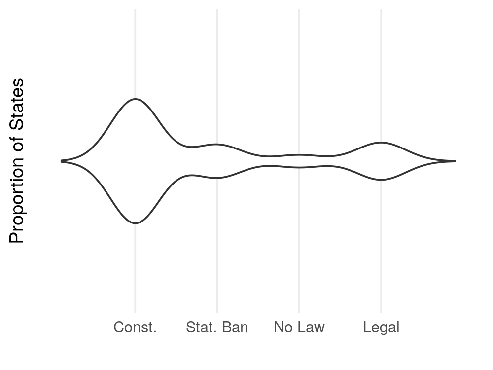
I intend to use this principle to produce a natural visualisation of the progress of same-sex marriage laws in the United States using this dataset by the Pew Research Centre. A reduced view of the dataset looks like this,
| State | 1998 | 1999 | 2000 |
|---|---|---|---|
| <chr> | <chr> | <chr> | <chr> |
| Alabama | Statutory Ban | Statutory Ban | Statutory Ban |
| Alaska | Constitutional Ban | Constitutional Ban | Constitutional Ban |
| Arizona | Statutory Ban | Statutory Ban | Statutory Ban |
| Arkansas | Statutory Ban | Statutory Ban | Statutory Ban |
| California | Statutory Ban | Statutory Ban | Statutory Ban |
| Colorado | No Law | No Law | Statutory Ban |
| Connecticut | Statutory Ban | Statutory Ban | Statutory Ban |
| Delaware | Statutory Ban | Statutory Ban | Statutory Ban |
| Florida | Statutory Ban | Statutory Ban | Statutory Ban |
| Georgia | Statutory Ban | Statutory Ban | Statutory Ban |
The typical way of representing this data may be a collection of bar plots faceted by year or, if you allow yourself to treat the nominal variable representing the type of law as ordinal, a ridgeline plot (previously known as a joy-plot) would be a good choice. The problem with these two methods though is that it is very hard to conceptualise the speed of change when we are only given single snapshots in time rather than the whole picture just like with the car example above.
Instead I wanted to produce an animated violin plot to represent this data in a way that would be easier to interpret the message of. The core of this visualisation is produced as follows.
1 | # load data from a csv on GitHub |

† Sadly, at of the time of writing this post,
gganimatedoes not have a simple way to add a pause between loops. This is the best solution I could find to overcome this limitation. UPDATE:gganimatenow has the ability to add pauses at both the beginning and end of the loop. See the documentation for theanimate()function to learn more.
This graphic shows us how much fluctuation there was on same-sex marriage law in the USA throughout the early 2000’s and almost makes clear the sudden impact on national legislation when the Supreme Court legalized same-sex marriage on June 26, 2015.