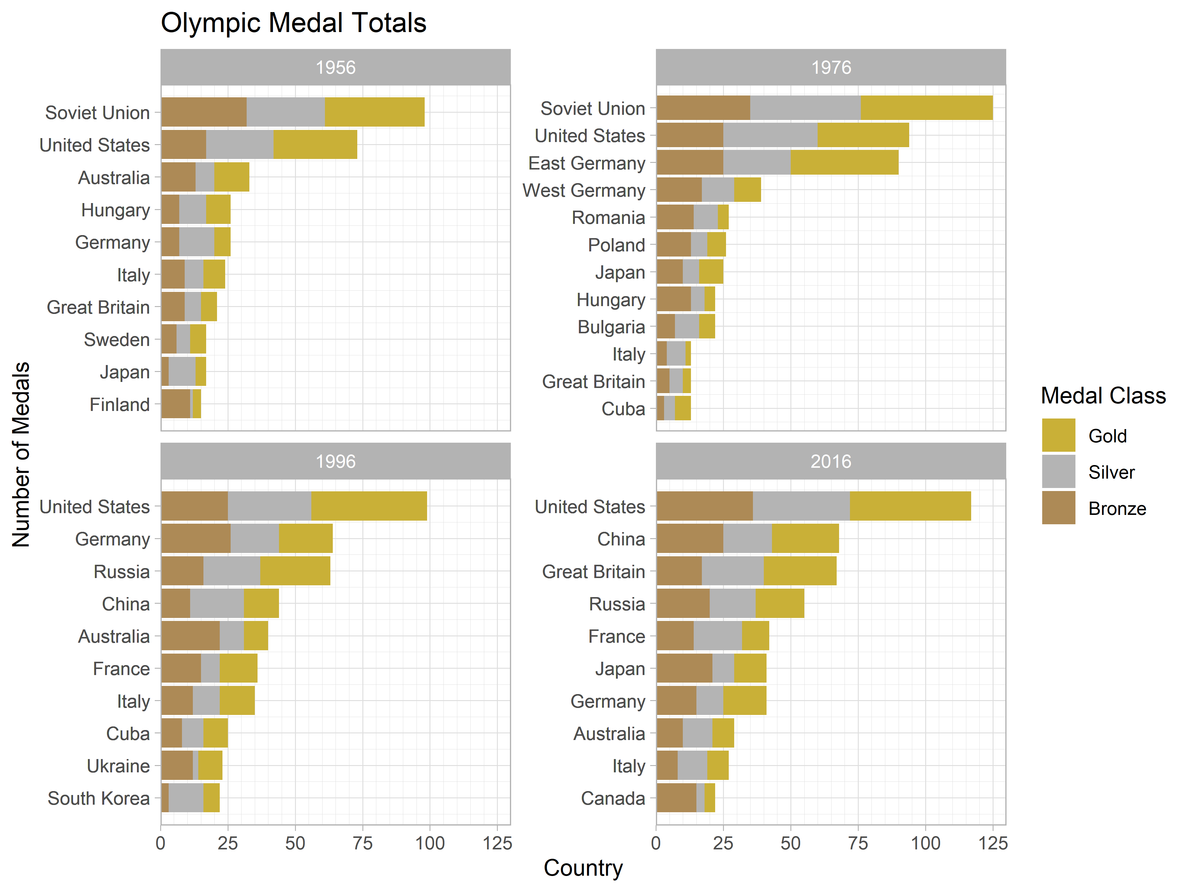
Ordering Factors within a Faceted Plot
ggplot2 is an amazing tool for building beautiful visualisations using a simple and coherent grammar—that is, when it wants to play nice. Sadly, this is not always the case and one can find themselves developing strange workarounds to overcome the limitations of the package. This post discusses one of these approaches, used to facilitate the correct ordering of factors within a faceted plot.
Streamlining Your Data Science Workflow With Magrittr
The Tidyverse is here to stay so why not make the most out of it? The `magrittr` package extends the basic piping vocabulary of the core Tidyverse to facilitate the production of more intuitive, readable, and simplistic code. This post aims to be an all encompassing guide to the package and the benefits it provides.
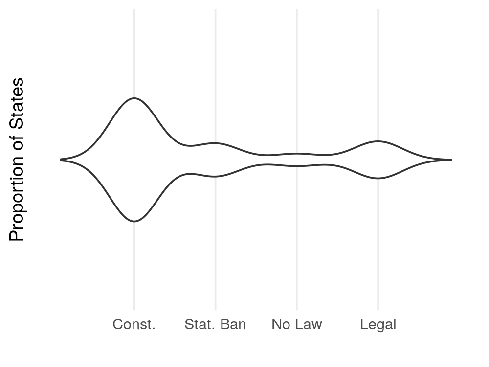
Gloopy Violin Plots
The fourth dimension is often overlooked in data visualisation applications but, in doing so, are we potentially missing out on some more effective ways to present data? In this post, I argue that there are certain use cases where adding a temporal dimension to your visualation greatly improves the clarity of the result in expressing you message. Furthermore, I offer an example of such a visualisation, produced using the `gganimate` package.
Recent