
Recently, I stumbled across an interesting dataset on Kaggle. It contained information on every event, for every relevant year of the last 120 years of Olympic Games. The dataset can be found at this link, and although it does have some minor data integrity issues (at least at the time of writing this post) it has clear potential for telling some amazing stories.
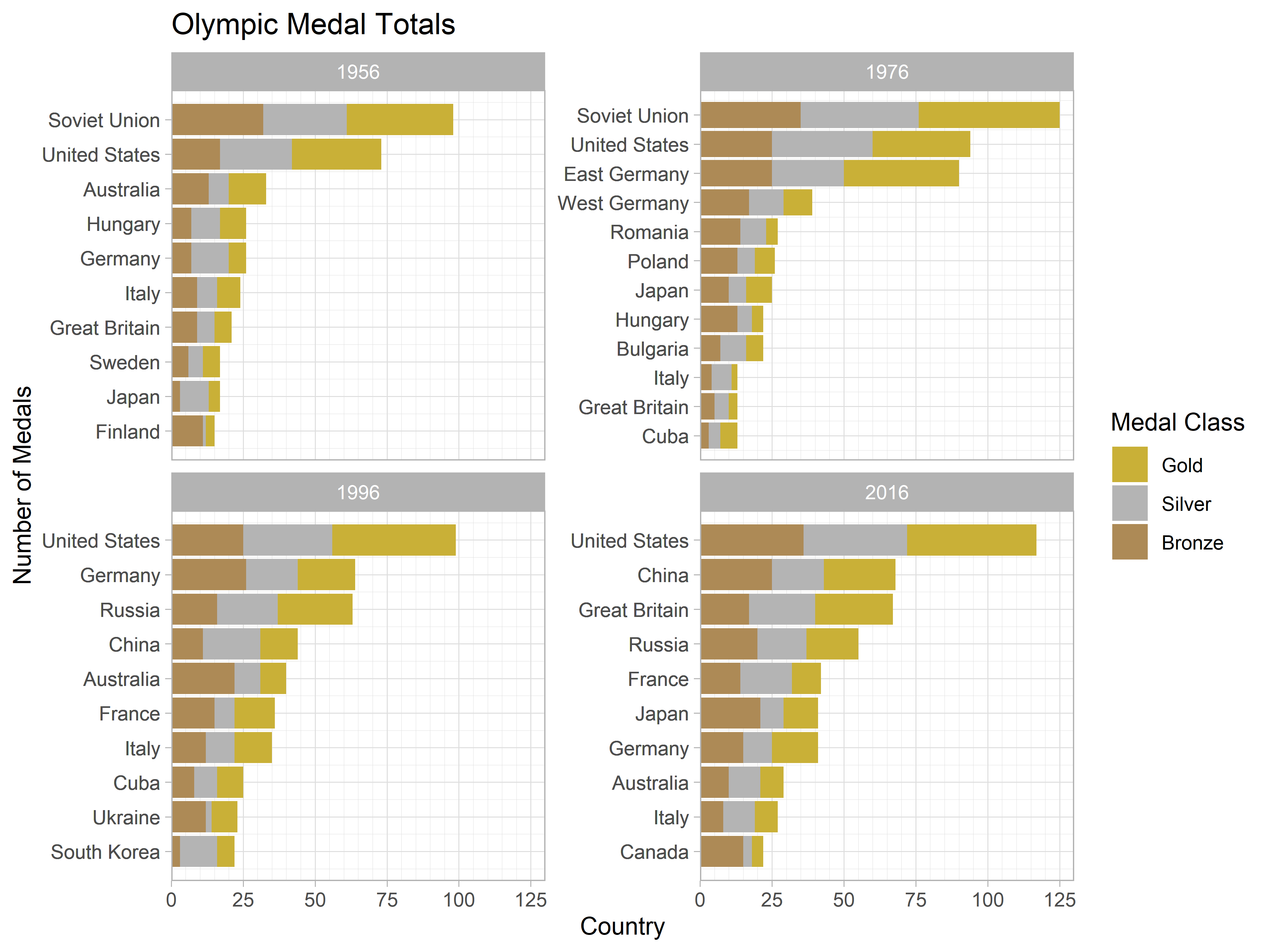
My plan was to start simple, and create a faceted column chart showing how many medals the top 10 countries won over a selection of four games. At least, I thought this would be simple. In fact, this plot ended up taking me down a data-viz rabbit hole, desperately trying to get by factors to order themselves how I wanted. Thankfully, I did eventually emerge, and so I am now here to share my journey so that the next unlucky victim of ggplot’s tyranny can reach a solution without so much frustration.
The Data
I will skip over the exact details regarding the full scope of the dataset and how I processed it for my use. The Kaggle page explains the contents of the dataset in clear terms and the source code for this project can be found on this blog’s GitHub repository. The important point is that after some messing about, I ended up with a dataset looking like this.
1 | medals_df |
| Team | Year | Bronze | Gold | Silver | Total |
|---|---|---|---|---|---|
| <chr> | <int> | <int> | <int> | <int> | <int> |
| Soviet Union | 1956 | 32 | 37 | 29 | 98 |
| United States | 1956 | 17 | 31 | 25 | 73 |
| Australia | 1956 | 13 | 13 | 7 | 33 |
| Germany | 1956 | 7 | 6 | 13 | 26 |
| Hungary | 1956 | 7 | 9 | 10 | 26 |
| Italy | 1956 | 9 | 8 | 7 | 24 |
| Great Britain | 1956 | 9 | 6 | 6 | 21 |
| Japan | 1956 | 3 | 4 | 10 | 17 |
| Sweden | 1956 | 6 | 6 | 5 | 17 |
| Finland | 1956 | 11 | 3 | 1 | 15 |
| Soviet Union | 1976 | 35 | 49 | 41 | 125 |
| United States | 1976 | 25 | 34 | 35 | 94 |
| East Germany | 1976 | 25 | 40 | 25 | 90 |
| West Germany | 1976 | 17 | 10 | 12 | 39 |
| Romania | 1976 | 14 | 4 | 9 | 27 |
| Poland | 1976 | 13 | 7 | 6 | 26 |
| Japan | 1976 | 10 | 9 | 6 | 25 |
| Bulgaria | 1976 | 7 | 6 | 9 | 22 |
| Hungary | 1976 | 13 | 4 | 5 | 22 |
| Cuba | 1976 | 3 | 6 | 4 | 13 |
| United States | 1996 | 25 | 43 | 31 | 99 |
| Germany | 1996 | 26 | 20 | 18 | 64 |
| Russia | 1996 | 16 | 26 | 21 | 63 |
| China | 1996 | 11 | 13 | 20 | 44 |
| Australia | 1996 | 22 | 9 | 9 | 40 |
| France | 1996 | 15 | 14 | 7 | 36 |
| Italy | 1996 | 12 | 13 | 10 | 35 |
| Cuba | 1996 | 8 | 9 | 8 | 25 |
| Ukraine | 1996 | 12 | 9 | 2 | 23 |
| South Korea | 1996 | 3 | 6 | 13 | 22 |
| United States | 2016 | 36 | 45 | 36 | 117 |
| China | 2016 | 25 | 25 | 18 | 68 |
| Great Britain | 2016 | 17 | 27 | 23 | 67 |
| Russia | 2016 | 20 | 18 | 17 | 55 |
| France | 2016 | 14 | 10 | 18 | 42 |
| Germany | 2016 | 15 | 16 | 10 | 41 |
| Japan | 2016 | 21 | 12 | 8 | 41 |
| Australia | 2016 | 10 | 8 | 11 | 29 |
| Italy | 2016 | 8 | 8 | 11 | 27 |
| Canada | 2016 | 15 | 4 | 3 | 22 |
To summarise, this is a dataset of 40 rows. Each row corresponds to the medals won by a particular country at a particular summer Olympic games. Each value of the year column is one 1956, 1976, 1996, and 2016, and only the ten countries with the most medals for each year are included.
Attempt 1 - Hope
What I then wanted to do, was to create a column chart showing the medals won by each country, faceted by the year of the games. My first solution was somewhat naive, going something like this.
1 | # tidy the dataset... |

It’s a valiant effort, but frankly, it’s just ugly. By default, ggplot uses the factor’s underlying ordering when deciding how to arrange a categorical axis. Since we did not specify an ordering, R defaults to using alphabetical order and so, as we can see, the y-axes is sorted alphabetically. Not only does this look bad but it makes the plot difficult to interpret. Which team had the 5th higher medal total in 1976? You’d have to take a second to figure it out; if the levels had been correctly ordered, this would be much simpler.
Attempt 2 - Compromise
The solution seems obvious now (I thought): the problem is brought upon by not specifying an order for the Team factor before plotting. So if we were to do just that, our problem should disappear. We can use the reorder function from base R (alternatively forcats::fct_reorder) combined with a mutate to achieve this (or so I thought). The code and result look something like this.
1 | # first, reorder the factors by total... |

Close, but no cigar. Some ordering has taken place, but things still aren’t quite right. The problem is that reordering has taken place at a global level, not per facet. This is not a bug, but the expected behaviour of reorder. When faced with duplicates in the factor it is given, it only orders the levels by using the median value for each unique level (forcats::fct_reorder uses the mean). Since our dataset contains teams that feature in the top 10 over multiple years (in fact, there are quite a few), this approach to ordering fails too.
We tried to play nicely and cooperate with ggplot, but that got us nowhere. It’s now time to bring out the big guns.
Attempt 3 - Aggression
At this point, I was starting to lose hope. Maybe this just wasn’t something within the scope of ggplot’s arsenal. I had one more idea though. It wasn’t going to be pretty or even that sensible, but sure enough it worked. Here is the final code I came up with and the resulting plot. I will explain the mechanics of this code immediately after.
1 | medals_df %>% |

Perfect! Not only is this easier to interpret but it looks much better. So why does this work? Let’s get into the details.
First, we create a new column, Order, which stores the order that each factor level should appear in within each year. We do this by first arranging by year, then total, and using the row_number() helper to save that ordering. The observations for the year 1956 now have orderings spanning from 1 to 10, and if we carry on till 2016, these have orderings from 31 to 40.
When we get to plotting, rather than using Team as our x aesthetic, we use this new Order. Since we use a free_y scale when faceting this results in us still having ten y-axis ticks for each facet. At this point though, the ticks will be labelled 1-10, 11-20, etc. for each facet. To correct this, we need to manually set our x-axis breaks and labels.
We do this in scale_x_continuous(). We set the breaks to be equal to the Order column (note we use . here to access the dataframe we piped into the curly bracketed section) and then use Team as the labels. This means that the numeric labels are replaced with the team name that they original corresponded to. This is exactly what we were after.
Wrapping Up
There you have it. It may not be the most elegant solution, but it certainly works. This approach can be adapted for any data that you wish to plot in this form. I hope that with this example to guide the way, a significant amount of frustration can be avoided.